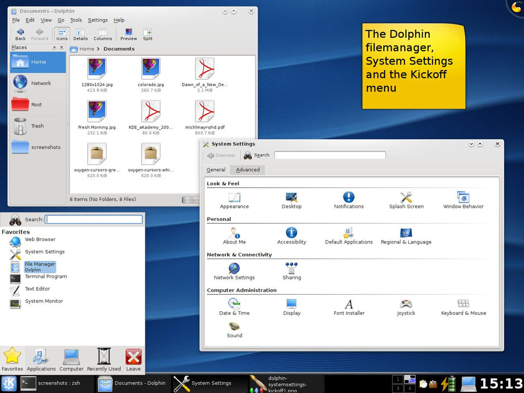
Getting reminded of late 90s & early 2000s design choices, the glassy feel of Bluecurve icon themes of Redhat Linux looked way ahead of their competition [1] Most people didn't have access to Classic Macs OS 8.5~9, which probably had beautiful icon sets too (Aqua?). As a highschooler, this looked so futuristic & colorful as compared to 2000/XP desktop themes & icons.
EDIT: Adding as postscript: Is there anything similar which would come close to Bluecurve today? TIA if there is anything in reader's minds.
> As a highschooler, this looked so futuristic & colorful as compared to 2000/XP desktop themes & icons.
Exactly my experience. The first time I installed Linux when I was around 15 I was surprised how modern, "sharp" and professional everything looked compared to Windows XP.
(The default Windows XP design was really the beginning of a downward curve for Windows designs. Windows 98 looked like a tool, Windows XP looked like a toy, which is a shame because Windows XP was a vastly superior (and in my experience ridiculously stable) OS. I always used the "classic" Win 98 design).
I had a Win2K cd-rom with a license key that I dragged around with me for almost a decade for this exact reason. It was all downhill for Windows after that.
Windows 2000 startup screen (as well as the ill-received Windows Me) was very elegant for its time. I think the Windows 7 GUI emulation in 8.1 was also pretty good.
What do you mean by Windows 7 GUI emulation in Windows 8? I didn't use Windows 8 much, but I thought all apps, including those that run on Win7, had a Win8 look, title bar, etc?
Windows 8 Metro UI and its flat glyph-inspired iconset (similar to minimalist signage, e.g in EU traffic signs) was such a disaster that 8.1, that soon followed, allowed options to toggle between Metro (for those who preferred) and the classic Windows 7 look & icons. It was called Legacy UI in their options.
Hence it was and still sometimes is being called Fisher-Price. Microsoft had to drastically change their flagship project so it would be attractive against OSX. The Whistler's Watercolor theme that existed during beta period was good but wasn't enough for the final release [1][2].
That period was full of candy/toys/glass/acrylic GUIs. Apple had Aqua, and Linux distros had Keramik and Plastik window/widget themes with Crystal icons in KDE. The latter become preserved in the Trinity envirnoment [1] since KDE moved to Plasma in version 4, which looked to me like a Vista's Aero step-sister [3]
Bluecurve was amazing. For me, nothing in the Linux world has equaled it since. It was so nice and polished with thoughtful colors and design. It was quite similar in colors to Mac OS 8 & 9 (the platinum gray, the purple-ish blue).
I sort of agree with that. That was the peak Linux GUI we saw (at least so far). Sadly after the Gnome GTK2 vs GTK3 forks, none of the child products carried the same finesse as Gnome 2.4/Bluecurve. They were sharp, colorful and vibrant. Windows icons seemed more 'classic' versus the KDE-inspired Bluecurve, Clearlooks which were more playful.
† While the current design continues to be called "Aqua" I personally consider the last iteration of Aqua to be Mavericks. While Cheetah, Puma, and Jaguar had the filling lines, Panther and Tiger had brushed metal, and the brief touchdown with skeuomorphism in Lion and Mountain Lion, they overall consistently carried the colourful glossy-watery "lick-it-candy" theme throughout - including icons - all the way, until Yosemite happens... Then it gets all silky with frosted glass, desaturated colours, and muted gradients, which just does not have the Aqua feel to me.
> Then it gets all silky with frosted glass, desaturated colours, and muted gradients, which just does not have the Aqua feel to me
The JonnyIvification of Apple interfaces starting with Mavericks & iOS7. Although it has grown on us, the flat designs were very jarring back then. Our brains were so used to pill shaped buttons & then everything felt flat
You can take a look at https://wiki.trinitydesktop.org/Icon_Sets But note that most of these icon sets will scale quite badly to modern HiDPI resolutions. (Though you could scale them manually using Lanczos upscaling, which usually gives a nice 'watercolor' effect preserving the broad look of pixel art.)
Bluecurve was fitting with the overall candy-like interfaces style at that time and yet, still giving a nice and professional, serious looking GUI for Redhat and later for short time Fedora.
I even skinned my XP with theme that was most close to the original - sadly, on Windows it was always a hard task and in few spots GUI was falling back into 9x widgets, not mention the usual problem with icons and other resource files.
Although the icons looked nice and alost every other element did, the whole composition of old Linux UIs nevertheless looked slightly ugly. Somehow it always felt like Windows UI designers did a better job polishing proportions, borders, margins/paddings and other things like that.
It was Linux that brought me into icon design. I did it pixelart style, manually. So not (good) scalable to different sizes, as was starting back then.
The main thing about windows icon (and overall) "design" as can clearly be seen in TLA is how ridiculously inconsistent it all is. Perspective, shape, colors, level-of-detail, layout, style. It's mind boggling that no-one hit the brakes in Redmond, hired an intern, just to polish out the worst offenders.
I mean, I get the complexity and business flows in place that produce this terrible mess. But in the end the software is packaged as one thing.
Is it their stronghold on the market (monopoly) that makes they can afford not to care? Or did their customers really not care (I mean, I did, and it was one of many things that made me fall in love with Linux back then)
A grammophone icon for music wouldn't exactly be cryptic to me and I'm not sure I ever heard one. But you said baffled when asked to describe, not confused by the icon.
I think we have precedent in the iconography of specialist occupations that have already existed in preindustrial times. The various brewing implements that adorn the labels of many breweries, the geometry implements that now only live on in freemasonry.. They all have names, but those names are lost to everybody but those who enjoy accumulating knowledge of old-timey things. Baffled, yes. But the world already is full of that kind of echoes from the past, it's not like someone is confused by them. Those who might consider a box of 3.5" a box of old save icons grew up with those save icons, it's the world they know.
Compass & straightedge. The mason logo has dividers & a square. Dividers are still used by machinists doing layout, mostly toolroom side not production side.
> I find it so interesting how many of the symbol used are with
objects that have or that will disappear from our lives.
It is interesting how iconography links to timeless design. Function
and appearance have a way of coexisting in good design so the "idea" of
something gets into semiotics.
Disk storage is a timeless concept. It's absent now but will no doubt
return in some new guise on the next wave of materials science and
storage tech.
The pen is timeless too.
Perhaps the weird one is the classic phone handset. My daughter who
never saw one except maybe on a cartoon, instantly knew what to do
with an old 1970s rotary I was hacking. The design "reaches out" and
suggests its usage. Partly that's our monkey brains that sees tools and
uses in everything.
I'm surprised your daughter knew what to do. I made a rotary mobile phone and showed it off in an exhibition, and kids were universally baffled. They tried to press the numbers in the wheel, then they tried to turn it without picking up the handset (why would they pick up first, everyone knows you dial the number and then you confirm the call), etc.
How did your daughter immediately grasp those non-obvious, hidden concepts?
Think I remember you posting this before when we had a discussion
about modding old phones.
I'm convinced she saw it in a cartoon like Dora or Fireman Sam. But
didn't hesitate to pick up the handset and put it to her ear.
EDIT:
Damnit I just had a flash of insight... thanks for the memory jolt.
As a baby she had a modern version of something like this [0] (hope
the image loads for you). They still make them almost the same.
It's a "walker/activity toy" with a rotary dial that made a sound
and a phone handset.
Ahh interesting, I hadn't thought about cartoons, thanks. I probably did post this before, I find it interesting how one thing can be entirely obvious to one generation, but completely opaque to another.
> why would they pick up first, everyone knows you dial the number and then you confirm the call
That's such an interesting point. Having grown up with landlines (DTMF and initially pulse-dialing ones), I was trying to do the very opposite with my mobile phone just yesterday! The cellular connection was atrocious, with my calls being rejected or silenced regardless of the carrier. I attempted to start the call with an empty number so that I could hear that the dialing tones were correct myself - of course, it didn't let me. I don't suppose the dialing stage of a modern mobile phone is analogue anyway, is it?
Ah, right - I've had a bit of experience with sending AT commands directly when the PinePhone first came out, but not gone into it any further since. In that light, it does seem rather naive of me to attempt to compare dialing tones by ear, but I suppose one reverts to type when desperate!
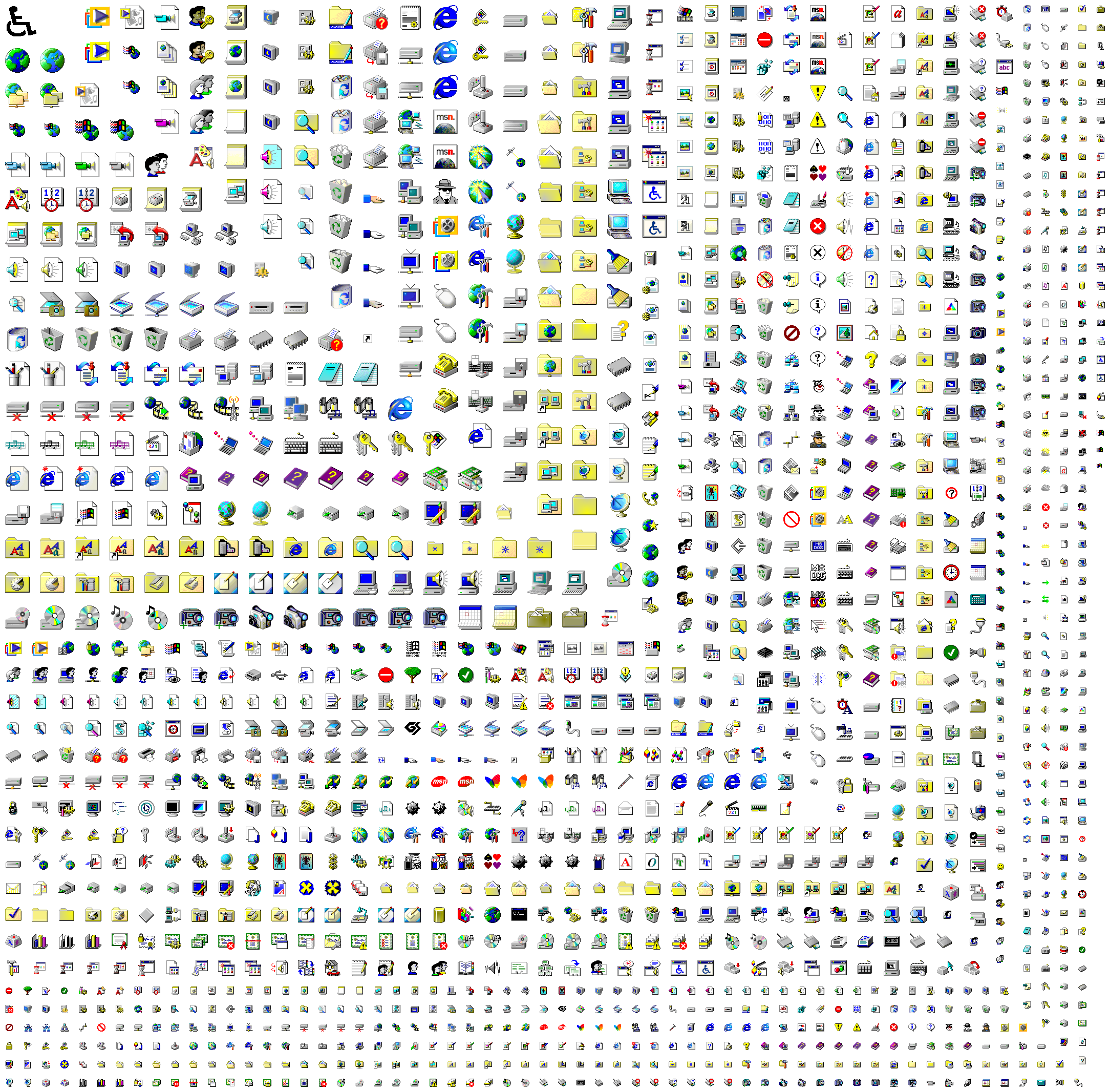
I've seen this and am amazed, also obviously grateful for the job, nevertheless I dream (I don't demand, this is just a dream) of a way better library including also all the icons from all the prominent apps and libraries of all the Windows eras since Windows 3.x. I mean also MS Office and Visual Studio to say the least. Ideally every single one should be accompanied with upscaled versions up to 512x512px.
This all probably is very questionable from the legal point of view but I have courage to hope nobody is going to care busting us as long as we only use these in small personal projects just a handful of people sees.
I even hope there will one day be a Dall-E-like neural network which would take a prompt and produce icons in Windows 3.x/98 style in any resolution you might need (i.e. up to whatever it takes to make a big icon on a Retina display).
> I mean also MS Office and Visual Studio to say the least.
And when I these I don't mean only the specific apps and file types logos but also the icons which could be placed on the toolbars, icons used in the dialogs etc.
Before I tried to make my own, I had been convinced that an icon is just a resized large image. For me up to this moment, it's amazing, how hard is to create an icon or pixel art. How every pixel counts, how the creator needs to manage the shades, gradients, and sometimes two pixels will show for example the white and the pupil of the eye.
They're real masterpieces. 256 colour pixel art, with some colours palette cycling to create animation by using the right pixels in the right place. But then he also changes the palette to create different times of day.
Some of them have rain or snow and the particles appear to move smoothly over the various parts of the background. Carefully switching the palette index not just for each bit of movement but also using a different section of the palette each time a snowflake transitions to pass over a different-coloured background layer.
There's a pool with a shimmering reflection! There's an animated aurora borealis! There's underwater scenes, oceans, fires, all animated via fixed palette cycling only!
And none of it looks forced, it all looks beautifully natural. You can open up the "Options" tab to see the palette and hover over the colours to see where they're used.
Imagine going back to Susan Kare's shoes in 1983, having to design icons in black and white in only 32x32 pixels. Made even harder by the fact that people had never encountered icons on a screen before.
A good icon seems like a good invention, something that has always existed, speaks to you directly and seems to have been recalled rather than created for the first time.
I think the nostalgia over some retro OSes is warranted.
Yeah! I had to fix a shed roof during one of the lockdowns when DIY stores were closed and amazed myself with what I managed to achieve with just the scraps i had lying around
Worth checking out is also text mode ansi art. A lot of similar techniques apply. It was more popular through the mid 90s, in particular the DOS (CP437) characters with the CGA 16-color pallet.
It forces it to map to physical device display pixels and use nearest-neighbour scaling; the last number there sets it to display each source pixel as 5×5 square in your browser's window.
* Oh, for webkit-based browsers, please replace `crisp-edges` with `pixelated`. I've just blindly trusted MDN compatibility data table [1] and did not verify it myself, and obviously there was a catch X[
Here is better cross-browser compatible version with sharp "pixels" for Chrome/Edge:
(And welcome to peculiarities of front-end web development. It is the year 2024 and there are still CSS level 3 modules that are not implemented reliably in latest browser versions, apparently.)
Are there any image formats that do support a metadata hint instructing the viewer to use NN scaling? It would be useful for pixel artists, versus the current requirement to manually scale your final export (although compression should make the file size difference minimal)
Such an effective design. I immediately recognize even subtle difference between icons at the lowest sizes. Meanwhile, today I get lost on my Android phone and in most desktop applications with low-contrast and monochrome icons.
Flat and monochrome icons have lost so much expressivity they are basically useless to express what they stand for. A lot of time I had to think for a moment while having the name of a menu written to make the connection between the image and the feature.
GIMP is my pet-peeve as well. I literally have to "read" each icon to find the one I'm looking for. Luckily you can change back to the color set, which is a lot better, although not perfect.
In around 1997 I installed I think Red Hat 4.x because I'd seen screenshots of the Enlightenment window manager and wanted that beauty on my desktop.
Now all I want is the Windows 98 look and feel back, when icons and user controls were clear and legible and consistent and you could drag a window from anywhere on a title bar.
I'd hate to be stuck with those tiny icons on a 4k display though. The problem is properly scaling pixel iconography doesn't work so well across a lot of devices.
I've seen some legacy fixed size games in tiny windows. If hate the os to be like that. My vision isn't good enough.
> Enhanced Classic icon theme (used with Win98 Second Edition, WinME, Win2K systems) from MicroSoft Memphis project for GNU/Linux inspired by Chicago95 theme (actually it’s a manual copy-paste fork) of Grassmunk with icons in Windows 98 SE style added and/or created by myself.
Chicago95 is nice, but these days you should also install the (experimental) GTK+4 theme from b00merang https://github.com/B00merang-Project/Windows-95 to get proper styling in the latest apps. That repo also has configs for Cinnamon, GNOME-Shell and MATE desktops in addition to the Xfce which Chicago95 also provides. (Unfortunately it has not been updated for some time, whereas Chicago95 is more up to date.)
In Windows 95, even if you authored an icon containing more than 16 colors, it would still be displayed as a 16-color icon. (With a strange exception that there were 4 additional colors that could appear in icons, including another gray, a greenish gray, sky blue, and a nearly white color)
Then finally Windows 98 updates the shell to actually support full-color icons, and this was a big deal. I think Microsoft Plus for Windows 95 also added this feature as well.
From a cursory (icony?) view, it seems to be missing the ones from moricons.dll, but memory is foggy and it might be that moricons.dll had been dropped by win98. It's been 26 years, wouldn't be surprised to find my memory is wrong.
MORICONS.DLL is still present in current versions of Windows! But (AFAIK) none of the icons were ever updated after Windows 3.1 to conform to newer design standards, so it's reasonable to leave them out of a set of "Windows 98" icons.
Funnily the original Win95 versions of these were flat shaded without gradients, designed with 16-color mode in mind. IIRC these 256-color shaded variants were added in a service pack? Or the Plus pack? And then came with Win98 by default.
That is one of the 16bpp high-resolution icons that came with Plus for 95 and IIRC by default with NT4. So the most probable place where you would see that is NT4 desktop (and indeed it looked somewhat out of place).
Most of them are just variations that would be used with different display color modes, as 24-bit color displays weren't ubiquitous yet back then. There are also some icons there from later versions than 98.
To the contrary, this set includes mostly icons from 98, but there are also some from 2000/Me, plus also some icons with "cool" in their filename that I don't know where they're from. I don't think there are icons from earlier releases there.
[edit] Apparently the "cool" ones are from 98 beta builds (1351-1569) that didn't end up being ever used in actual release.
This might just be me but I'm surprised how many icons are quite confusing in that certain icons either look very similar to another one (a lot if them literally are just glued together) or shares similar colors.
It's probably one thing I actually like more about the XP or Linux (KDE) iconset.
- Some of them are the same icon but the slightly more modern counterpart (ie where more colours were supported
- Some of them are the same icon but in different states (eg empty recycle bin vs non-empty recycle bin)
- Some are actually intended to be used as crude animations (eg the 4 icons of magnifying glass over the computer are actually just 4 frames of an animation)
- Plus pixels were "bigger" back then so you had to do more with less. But thankfully subtle changes were also more noticeable (again, because pixels were "bigger")
Personally, I always slightly preferred the 16-color Windows 95 icons. Something about them made them a little cleaner, clearer, and quicker to identify to me.
Related: I've written a thing that can automate extracting various resources (icons, cursors, bitmaps, sounds) from vintage Windowses: https://github.com/akx/res-extract
... originally because someone needed the Excel 95 icon as a Slack emoji, naturally.
I don't find the initial Cleartype algorithm used by Windows to be exactly good either. You could tell from miles away that it's distorting fonts significantly in order to fit them into the pixel matrix. I think they've improved it for Windows 10/11 though.
EDIT: Adding as postscript: Is there anything similar which would come close to Bluecurve today? TIA if there is anything in reader's minds.
1. https://upload.wikimedia.org/wikipedia/commons/7/71/GNOME_2....
2. https://upload.wikimedia.org/wikipedia/commons/b/b8/Fedora-y...