I'd have to disagree with you on that one. I recently migrated to Fedora from Windows 11, which gave me the chance to try Plasma, GNOME, and a couple other desktops.
Plasma is exactly what I don't want in a DE. It’s extremely configurable, but also overwhelming, and I don’t think that’s something the average user would feel comfortable navigating.
I ended up choosing GNOME. It feels visually cohesive, and the design is much more opinionated — they’ve clearly made decisions about what should and shouldn’t be part of the core desktop experience.
I don't see how Plasma is any easier or harder to navigate than Windows. If you find the customizations overwhelming, then just... don't. It's fine in its stock form. I turn off the top-left corner thing and leave everything else alone.
Thank you for saying this. Power users love to complain about how GNOME took away many settings and options, and just made some hard decisions. I left GNOME many years ago since I miss these options, but I'm going to refer to your comment the next time people complain about the direction they took: there clearly is an audience of people that simply don't care about customizing every bit of their desktop environment, and GNOME is targeting exactly them. It's an audience we must cater to if we want Linux on the desktop to be successful.
I settled down for Fluxbox back when it was still actively maintained. Ever since its death I have been using IceWM, mostly because it is so much faster than GNOME or KDE-Plasma. I think both KDE and GNOME went into the wrong direction though. GNOME because it forces everyone into the shell-centric way to use a computer, similar to a smartphone (the whole UI constantly reminds me of a cloned OSX smartphone interface, for GNOME3 that is; mate-desktop is more of a desktop-centric UI but sadly the project slowed down immensely in the last few years, aka becoming more and more inactive really). KDE indeed has too many configure-options, but the defaults are more similar to the 1990s desktop-centric era shaped by Microsoft. I like that approach more than GNOME although in the last few years KDE also went the wrong way, largely due to Nate, David Edmundson ("our destiny is systemd"; that reminds me of Firefox "you must have pulseaudio for audio on youtube", how strange I can hear audio via chromium/thorium just fine, so what are the Mozilla devs thinking here ... not much, that is for sure) etc...
Not only that, because it has so many options and more of a bazaar-style development, nothing is optimized.
Right now the systray has a very ugly delay when opening applets like WiFi or sound. Up to 1.5 seconds (!). This doesn't happen with the applets bare in the menu bar, so there must be some sort of negative interaction there between the systray code and applet code.
This is on a bog standard KDE install too.
I don't like Gnome's high and mighty attitude either, especially because it chases people away from making bug reports or contributing. And when 90%+ of your users uses a particular extension (Dash to Dock), maybe make that behaviour integrated and the default.
At this point my hope is squarely aimed at PopOS' COSMIC environment.
But I do think some of the systray things are overly complicated. E.g. why does the volume widget list all audio outputs and inputs by default?
On the other hand some things are really great. E.g. which other DE lets you adjust the screen brightness (the real one via DDC/CI) from the systray, or start video screen capture by pressing print screen?
KDE is definitely better than gnome at this point.
I've encountered the same KDE bug in NixOS though from what I understood when I did some digging[0][1] it doesn't manifest on distros like Fedora.
Now I'm using Cinnamon until the bug gets fixed which I enjoy too but it doesn't come close to the ease of use of KDE. And when I say ease of use on KDE I refer to the fact that out of the box you can pretty much do everything you need to without having to search for extensions or hunt for settings, someone already thought of what you wanted to do and made it straightforward to do. Sure it's overwhelming to be presented with a lot of things at once e.g. the screen capture UI but when you need to do something that's not the base case it's easy to see that the UI has got you covered.
> E.g. which other DE lets you adjust the screen brightness (the real one via DDC/CI) from the systray, or start video screen capture by pressing print screen?
I can't agree more, I wish Linux had some good desktop environment.
It's fine giving lot of customization but the default got to be good, and at the opposite (gnome) it's fine to give no customization option as long as it's well thought out and makes sense.
Sadly, it's neither the case.
The best I could find was cinnamon desktop, they're not too bad.
I don't mind changing things on KDE, but the defaults are useless to me. Too many annoying things, all those time-wasting gimmicks, on-hover uselessness. It is clearly written for another target audience, e. g. Average Joe coming from Windows. While that is fine perhaps for those users, to me the default is useless. And I think many others feel in a similar way. To me the defaults in GNOME are even worse though, so it is a lose-lose scenario. But things can be configured, so that problem can be solved for most settings or behaviour; I am just not convinced that sticking to the defaults works that well.
That's the problem I have with most DE talks though
People act like these issues are going to "stop the Linux migration" or otherwise, and then they give examples of things that most users will never do/isn't even possible on windows / mac
It feels like most people don't like some DE's just simply because it's not what they're used to, not because there is actually a problem with them
I won’t disagree with you, KDE is certainly usable from a clean install. But calling GNOME primitive in comparison feels off to me. It was actually KDE’s applets and overall fit and finish that pushed me toward GNOME.
Never expected someone to call GNOME straight up ugly. IMO it's currently the most stylish DE out there by far (comparing to the default look of other DEs). Opinions, huh.
I totally agree it's not for the average user but I'm not an average user. That's why I like it so much. I love the way I can make my computer work the way I want it, rather than being stuck with someone else's design decisions and having to adapt to them (I really hate opinionated design). My KDE is customized heavily though I never needed to use addons because it's so configurable.
I really like this about KDE. And the number of options isn't in the way. When I'm thinking of something new to do there's usually an option for just that that I'd never seen before. I love software like that that feels way ahead of me, almost anticipating my wishes.
Gnome on the other hand, their developers have this attitude of "you shouldn't want to do this". I don't like software or other people telling me what to do. I'm sure their stuff is based on UI principles but those are made for the masses too. I only care about what works for me.
But yeah I'm a power user, that's not for everyone. I love that KDE exists though. And it's great that you like gnome, that's the power of Linux/FOSS.
The only thing I object to is when people claim Linux should get one standard UI (and then they usually want that to be gnome). That's not ok for me. But it's also impossible to enforce anyway.
Konsole on left, ghostty (which is gtk) on right. The latter has at least 3 additional lines visible outputting the same command. The giant copy paste buttons, tab bar which wastes a ton of space, are typical of kde apps. The klutter isn’t just visually annoying it makes the apps less useful.
Honestly this is the only complaint I agree with. KDE plasma desktop and its configurability looks and feels great... but all their in house actual windowed applications like Konsole and Kate are mediocre at best. All that duplicated effort seems wasteful.
I wonder how much QT has to do with this. AFAIK the only _decent_ bindings are still C++ and Python. For KDE it might just be C++?
There's plenty of valid criticism of GTK but choosing C over C++ isn't one of them. It seems like there is a new Rust GTK app every week, and other languages as well, thanks to the availability of bindings.
I'm curious how long relying on C++ contributions is going to last.
It's honestly just Konsole. Kate is very good, you can legitimately use it as a vscode replacement if you want. Dolphin is also the best file manager and it's not even close.
I don't want Kate to be vscode, I want it to be notepad.exe. I want it to open a document instantly and let me edit and save and close with no distractions or delays.
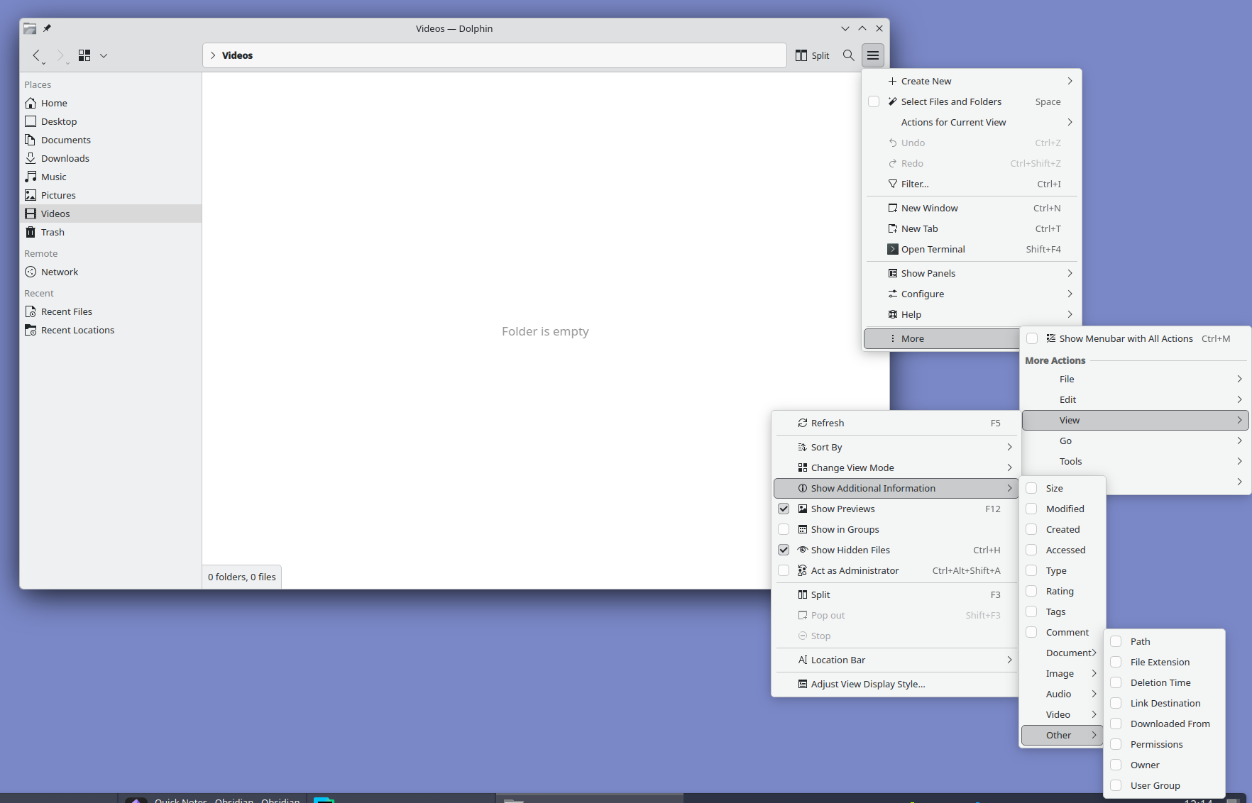
Look at it and tell me this is normal. I love Plasma but oh man do they need to hire a real designer. Someone with balls to unfuck the interface and move all advanced settings out of GUI into a well documented config file.
That seems a bit contrived to me. Okay, that particular place is pretty deeply nested, but it's clearly a regular menu tucked away in there, with a option to show the menu bar. If you turn that on, then those options are half as deep. Or if you don't need to adjust those options, you don't go that deep.
The sibling comment, meanwhile, is complaining about extra space devoted to explicit controls for all of the extra options. Well, you can't have it both ways. If you want to have a lot of features and options, you have to either devote some space in the main UI to them, or have a lot of deeply nested menus like that.
Or I guess you could do a config file somewhere, but IMO that's even worse. If we're going to complain about bad UIs, isn't it even worse than some deeply nested menus to need to open a separate file somewhere else with a separate program and learn whatever config file syntax they happen to use.
While I prefer deeply nested menus (and I acknowledge I'm a weirdo at that) there's plasma-manager if you happen to use Nix and home-manager. I don't know if it will help in that specific case but if you'd rather have the config in a well documented file this could generally help.
Nothing wrong with nested menus. The problem is that plasma has a classic File menu inside of a hamburger menu hidden under a "More" button with a whole set of duplicated options that can be found in other parts of the interface. It's nuts.
I'd rather have all that mess removed and settings 1% of the user base "needs" moved to a config file. I don't want to add an another layer of complexity with external configuration tools.
No alignment issues, menus sorted by professional designers, easier to learn UX like ribbon menus and a lot more.
Feel like the design issues stem from it being shaped by existing power users. Familiarity tend to downplay design issues so stability took priority, even though the UX never should've been stabilised in the first place.
I recently installed Fedora with KDE Plasma on a new computer and I can't say I feel the same way. The UI is still clunky (eg the file explorer is clunky) and I'm running into minor bugs pretty regularly. Windows will be sized incorrectly after a restore sometimes (failing to take into account the bar I added at the top), switching between multiple windows of the same program and a separate program seems non-deterministic, random UI components occasionally crash and restart.
I don't want to be negative for the sake of it but I constantly read these really positive comments about Linux on the desktop (in general or in specifics) and it gave me a false impression of what to expect. Not the first time I've fallen for this either over the years.
It's rare to see a perfectly stable desktop UI in general. Even on my Mac and iPhone minor bugs are almost a daily occurrence.
But KDE especially is a combination of huge scope and limited resources, whenever I used it there was always something obviously unpolished.
How is it on older or budget hardware though? It’s been a long time since I tried KDE, and in between even worked with Xfce because Gnome was a bit more resource intensive. Is it still the case that in terms of hardware specs and demand of the hardware, KDE needs/uses more than Gnome? I guess Xfce will be in a different league capability wise and resource requirement wise.
AIUI, they actually really made an effort to improve on that front, to the point that KDE is actually really good about resource use these days, which is eg. why it was picked as the default for the pinetab 2.
I use LXDE on my new boxes, but on a 15 year old machine I wasn't sure what the Linux distro had defaulted to. I was surprised to see it was KDE. That machine takes 30 sec to decrypt the disk encryption key (stupid proof of work functions!), but the desktop environment is as snappy as LXDE on high-end 2026 machines.
I haven't compared those two with XFCE recently, but they all seem fine these days.
I run it on my RK3588 based MNT Pocket Reform. I have to force the GL ES 2 backend because of, presumably, Panfrost bugs, but otherwise it runs well despite the fairly weak CPU and GPU.
How old and what budget? I spent a good chunk of the late 2010s rocking Plasma 5 on a machine with a first-gen i5. It 8 GB of RAM and an SSD, which probably helped, but it ran great!
I did, but I don't share the sentiment. Moved this year from macOS and KDE is over-engineered with little thought put into the UX. For example, try to take a screenshot. I was quite literally shaking my head for good couple minutes looking at this abomination. It's so extremely confusing, all over the place, bogged down with tons of switches, modes, it's like you need to spend 30 minutes to understand how this thing works and all the Whys. Took me couple days to realize it was an actual Photo app in its screenshot mode. If only they spent some of their increasing budget on some proper UX usability testing and not rely on their people's gut feelings and a "that'll do" mentality...
Meanwhile, Gnome just works exactly like you'd expect it to. I said it before already, but Gnome is for people moving from macOS and KDE is for ex-Windows veterans.
And, for the record, I don't want to praise Gnome's overly-minimalistic approach, either, which too gets annoying when you have to find an extension for every stupid extra setting beyond the defaults. But, all in all, I much prefer it over KDE and wouldn't switch back. Not to mention the aesthetics, because there's no comparison if one shares the Apple/Braun ideals on design.
A plot twist here is that I am also a KDE app developer...
It's a bit slow for me, in my experience. Sometimes doesn't want to copy the image to the clipboard. Saving is also wonky. Really wish I just had sharex on Linux
Spectacle used to just let you automatically save with no confirmation dialog, then they changed that a year or so ago. Maybe it's still possible to configure it but I was less than happy to have my default changed.
What Photo app are you referring to? On Debian Trixie, I just get the screenshot app, Spectacle. It shows the screenshot it just took, tells me where it’s been saved, lets me do stuff with it, and lets me take another one. It could do with a facelift, but it’s fairly clear, really. I wonder if they changed it later or if the distribution you used deviated from the defaults.
I believe they changed the app since Trixie was released (Trixie has KDE 6.3, the changes were in 6.4) and buried a lot of the really common settings behind menus. E.g. you might want to take a screenshot on a delay, and that's now hidden behind a menu whereas they used to surface the most common features on a panel.
I'm on Debian bookworm, and a screenshot is one Meta-Shift-S -- I just highlight the region I want to capture, and I get a dialog prompting me to (with one click) copy to clipboard, save to file, or annotate. There's a handful of out-of-the-way options as well, depending on what exactly you want to do. What's --- so abominable about that?
I would be very annoyed if every screenshot I took was saved. I often take dozens of screenshots per day, and I save one maybe once a month. That means my screenshots folder only has meaningful entries. If everything was saved, I'd have to clean it up all the time.
There might be a small misunderstanding regarding the "dialog". Once you've selected an area you're shown the outlines & can still modify them, and the buttons (Accept (for further editing in Spectacle), Save, Save As, Copy, Export) are shown below those outlines.
This approach seems objectively superior to your suggestion.
The meaningful entries get named for later searching while the rest are kept as my computer's little photo journal or something. Comes in handy a few times a year.
> If anything, that's not a typical user user case by far.
The scale may not be typical, but the pattern (many more screenshots copied to clipboard than saved as a file) is something I see across all kinds of users around me, be they technical or even very much non-technical.
Let's not turn the defaults into "The Homer", okay? Allowing the user to choose their preferred action in the same step as allowing them to change the outline doesn't make things unnecessarily confusing, doesn't add unnecessary clicks, or anything else.
It does. If you paste (to slack, email, whatever) after taking a screenshot on Gnome, you will attach your screenshot. It is also saved on ~/Pictures/Screenshots.
If Gnome made their screenshot feature an app then it would be possible to just use it on any other desktop too, as is usually a strength of Linux. And it would then also be possible to add it to Gnome's dock, which wasn't doable last time I checked.
I don't get how this can lead to confusion. You can hit PrintScr, draw a rectangle and hit save, or enter "screenshot" into the bottom left menu, rectangle, save.
There you can also see the common options with shortcuts for "Full Screen" etc, at least on openSUSE Tumbleweed. I would assume that is the default behaviour.
The nice thing about Linux is that there’s a DE or WM for everyone. Personally I can’t imagine running a whole desktop environment when all I want is to draw some windows and a status bar. But, to each their own!
I really like KDE plasma, it's the best DE out there once configured to mimick Gnome 2 / Mate, but I agree with you on screenshots! Also, Konsole required much configuration to be not way too busy.
I am absolutely certain they're headed in the right direction, but even some minimal Usability Testing would give them tremendous amount information on all the low-hanging fruit they could fix/optimize and substantially improve the on-boarding for newcomers.
What are you talking about, spectacle is everything I want in a screenshot tool and I do not want it to be any other way. If you want something that just takes a picture then you might as well go back to 2012.
Except that's exactly my point. You come to that DE, you don't want to modify and optimize every single nook and cranny. I mean sure, some do, but this is a vast minority. If Linux is to become truly popular desktop, it needs DEs like Gnome, aiming at those who are just fine with all the defaults curated for them.
Yeah, and more DEs like GNOME will just take devs away from GNOME, and GNOME will regress. There aren't tons of avilable open-source devs who have the skill necessary to create a DE.
There's a lot of "we need this" "we need that" in the open-source world. But when you look at all the limitations objectively, we've already reached the highest point we can achieve.
That's just reduction to absurd. I clearly meant their approach to UX and usability. Are you gonna argue only one DE in Linux is to take serious approach to it?
Or system tray icons or application menus. I have used GNOME since forever, but it became barely usable. You can bring back most functionality with extensions, but they are very buggy.
What you're talking here is what I mentioned: Gnome maybe goes too far with removing some functionality, but I personally haven't used desktop icons in like 10 years and, based on current macOS trend, neither does Apple bet on it. But I am talking about overcluttering and overcomplicating UX, not oversimplifying it. Both things can be true and my KDE complaints are about the former, because I was responding to someone else praising it.
I think you are correct to state that KDE can still improve in a lot of ways. Although I personally find the new screenshot tools to be great: I now use them a lot more than I used to, especially to annotate things.
I was responding to your belief that somehow Gnome is better or that "Gnome just works exactly like you'd expect it to," as you stated. My point is that it does not. And you might not find Desktop icons useful, but I (and millions of other people!) use them every day and have for decades. I could drag and drop icons on the desktop of my family's first computer, a Mac that ran System 7 in the early 1990s. And then our Windows 95 box. And then Windows 98, and 2000, and XP, and a laptop that ran Vista. And then that laptop running Ubuntu with Gnome 2, and then Ubuntu Unity, and then Gnome 3... until Gnome decided, nope, sorry!
So you chose the outstanding screenshot utility to highlight the problems with KDE Plasma interface? Really? Why not something like this?: https://files.catbox.moe/uvxbea.png
I just don't share your point of view. I think KDE Plasma screenshot utility has a decent UX. You just press Print Screen key and then either press Enter to capture the whole screen or drag your mouse to select a region and then confirm with Enter. It then opens your capture in a small window where you can save it or discard it. All extra buttons have icons that are clear and easy to understand on first glance and functionality they provide is useful and belongs in a screenshot utility. It's pretty decent.
Edit: Since we're talking about UX what do you think about Gnomes window management? If more than one window is open and one of them is maximized you need two clicks to bring the other one to the top. Every single time. Gnome user is pretty much expected to learn keyboard shortcuts to overcome the terrible UX. Most just install addons that bring back basic UI elements but the addon API is not stable and most addons usually need an update between Gnome versions which wears out developers which results in the Gnome addon repo being full of abandonware. I used Gnome as my DE for approximately a year before I realized that all the time spent trying to wrangle that stupid fisher price DE into any resemblance of functionality would be better spent on something more productive.